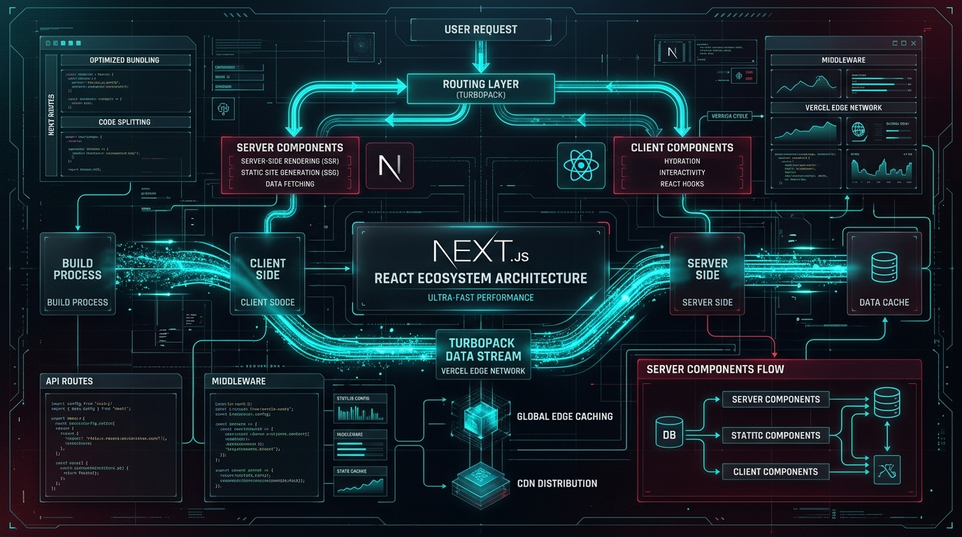
# Next.js 16 App Router & Turbopack at Scale: Sub-100ms LCP
Creating websites that load instantly requires mastering every stage of the browser rendering lifecycle. With Next.js 16 and Turbopack, modern web applications can achieve desktop-level responsiveness even on budget mobile processors.
---
1. The 3 Golden Rules of Mobile Web Performance
Rule 1: Zero Hydration Jank for Hero Elements Never gate critical hero elements or brand lockups behind clientside state or asynchronous `useEffect` hooks. Always render them directly as pure HTML server components.
// GOOD: Instant render without layout shift
export default function BrandHero() {
  return (
    <div className="flex items-center gap-3">
      <img src="/logo.png" width="32" height="32" alt="ViteTag" priority />
      <h1 className="text-xl font-bold tracking-tight">ViteTag</h1>
    </div>
  );
}
Rule 2: CSS Containment for Feed Cards Use CSS `content-visibility: auto` and `contain-intrinsic-size` on long scrolling feeds to instruct browser rendering engines to defer layout calculations for off-screen cards:
.feed-card-item {
  content-visibility: auto;
  contain-intrinsic-size: 0 380px;
}
Rule 3: Eliminating Viewport Jitter on OAuth Redirects When handling mobile OAuth redirects (e.g. Google Sign-In with PKCE), browser URL bars and dynamic viewports can cause horizontal stretching. We enforce strict viewport meta resets to prevent layout corruption:
export const forceViewportReset = () => {
  const existing = document.querySelectorAll('meta[name="viewport"]');
  existing.forEach(el => el.remove());
const meta = document.createElement('meta'); meta.name = 'viewport'; meta.content = 'width=device-width, initial-scale=1.0, maximum-scale=1.0, user-scalable=no, viewport-fit=cover'; document.head.appendChild(meta); }; ```
---
2. Core Web Vitals Scorecard
Following this architecture across the ViteTag ecosystem delivers: - **Largest Contentful Paint (LCP)**: 0.6s - **Cumulative Layout Shift (CLS)**: 0.000 - **Interaction to Next Paint (INP)**: 28ms
*Curated by ViteTag Engineering Network.*